

Welcome To Architecture Of Clarity & Visual Systems
Here, I invite you to explore my editorial design, corporate identity systems, and visual narratives. Just as in my studio art practice, I view graphic design not as mere decoration, but as a living bridge between complex ideas and human understanding, bringing quiet order, authority, and clarity to dense information.
Drawing from my background in fine arts and visual communication, every system I build is crafted to turn heavy institutional data into an intuitive, trustworthy experience. I am currently available for freelance design collaborations, agency partnerships, and bespoke editorial commissions.
The Blueprint Of Institutional Authority
Bringing Visual Stability And Clarity To Complex Financial Architecture
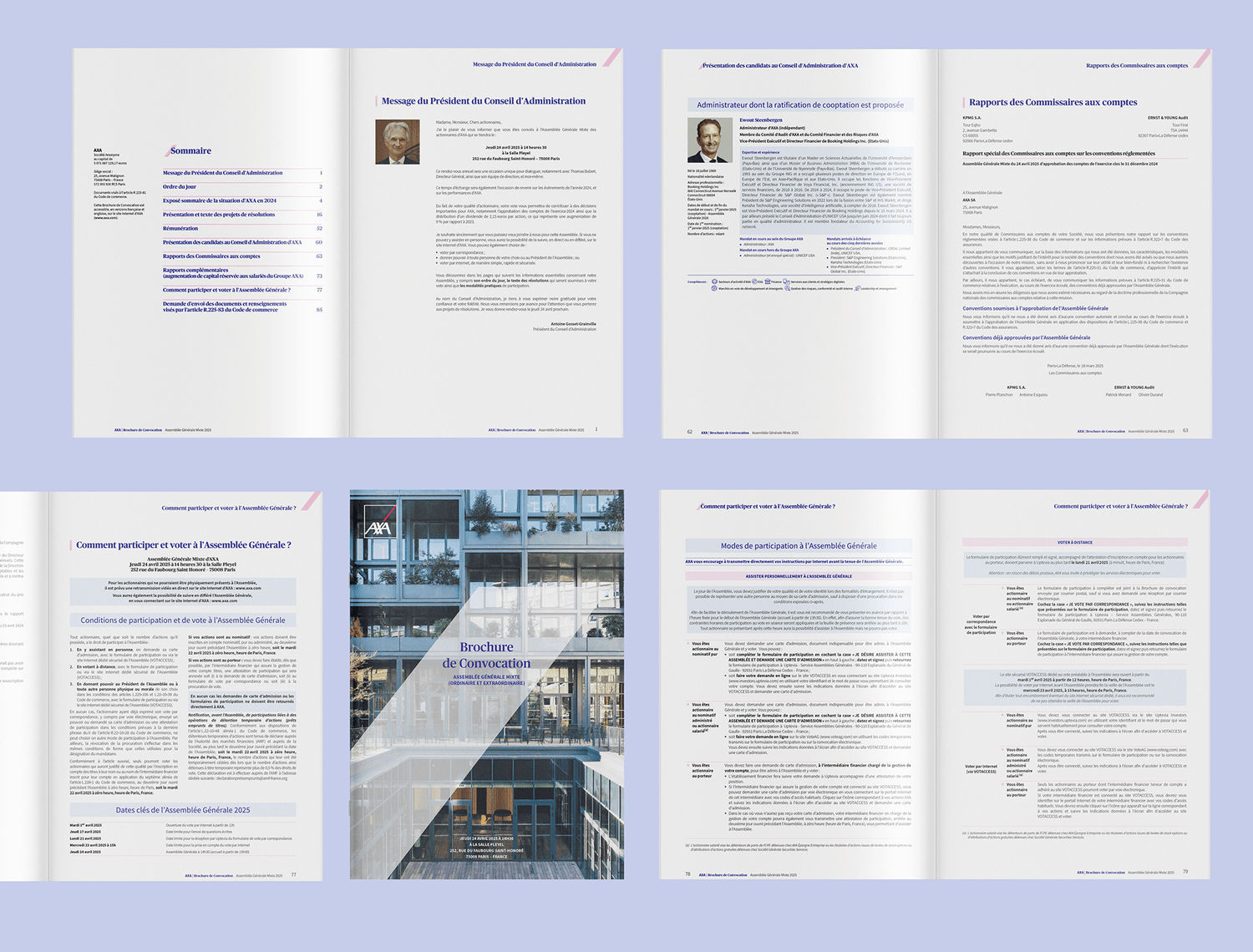
AXA — Adaptive Corporate Reports
Working alongside Candy Design for global financial leader AXA, this project focuses on turning dense, intricate corporate data into a calm, readable experience. When navigating high-stakes financial reporting, clarity is everything, a well-built layout removes visual friction and builds immediate trust with the reader.
To achieve this, I engineered a rigorous modular grid system capable of adapting across two distinct formats: the comprehensive regulatory report (URD) and the more expressive Shareholder Meeting Brochure (Brochure de Convocation). By balancing strict typographic structure with clean visual breathing room, complex financial figures become effortless to navigate.
The Rhythm Of Exactitude
Translating Global Scientific Precision Into Editorial Clarity

BIPM — Masters Of Measure
Created for the International Bureau of Weights and Measures (Bureau International des Poids et Mesures), the intergovernmental institution guarding the world's standards of measurement since 1875, this project centers on the editorial design of their 2025 Financial Statements (États Financiers).
Inspired by the atomic definition of a second (9,192,631,770 cycles), I paired orbital, scientific graphics with disciplined editorial typography. The result transforms intricate financial tables and international governance notes into a transparent, authoritative publication where every figure sits in quiet, calibrated harmony.
Giving Human Warmth To Sustainability Data
Harmonizing Industrial Precision With Environmental Stewardship
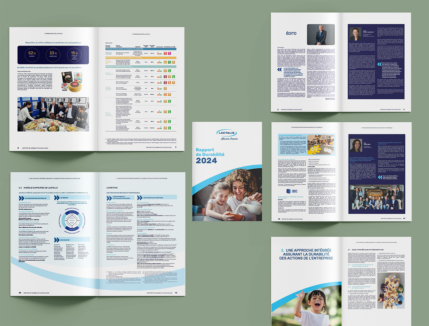
Lactalis — CSR Strategy & Visual Narrative
Directing the 2024 Sustainability Report (Rapport de Durabilité 2024) for global dairy leader Lactalis required a visual language rooted in transparency and warmth. The goal was to build a cohesive design system that frames the company's environmental and social milestones within a clear, trustworthy narrative.
Through thoughtful editorial pacing and data humanization, complex sustainability metrics, governance tables, and executive insights are brought to life alongside real human stories. By balancing structured information graphics with approachable photography, the report invites readers to engage effortlessly with the company's long-term commitments.
A Digital Sanctuary For Public Truth
Bringing Civic Accessibility And Digital Clarity To Global Justice
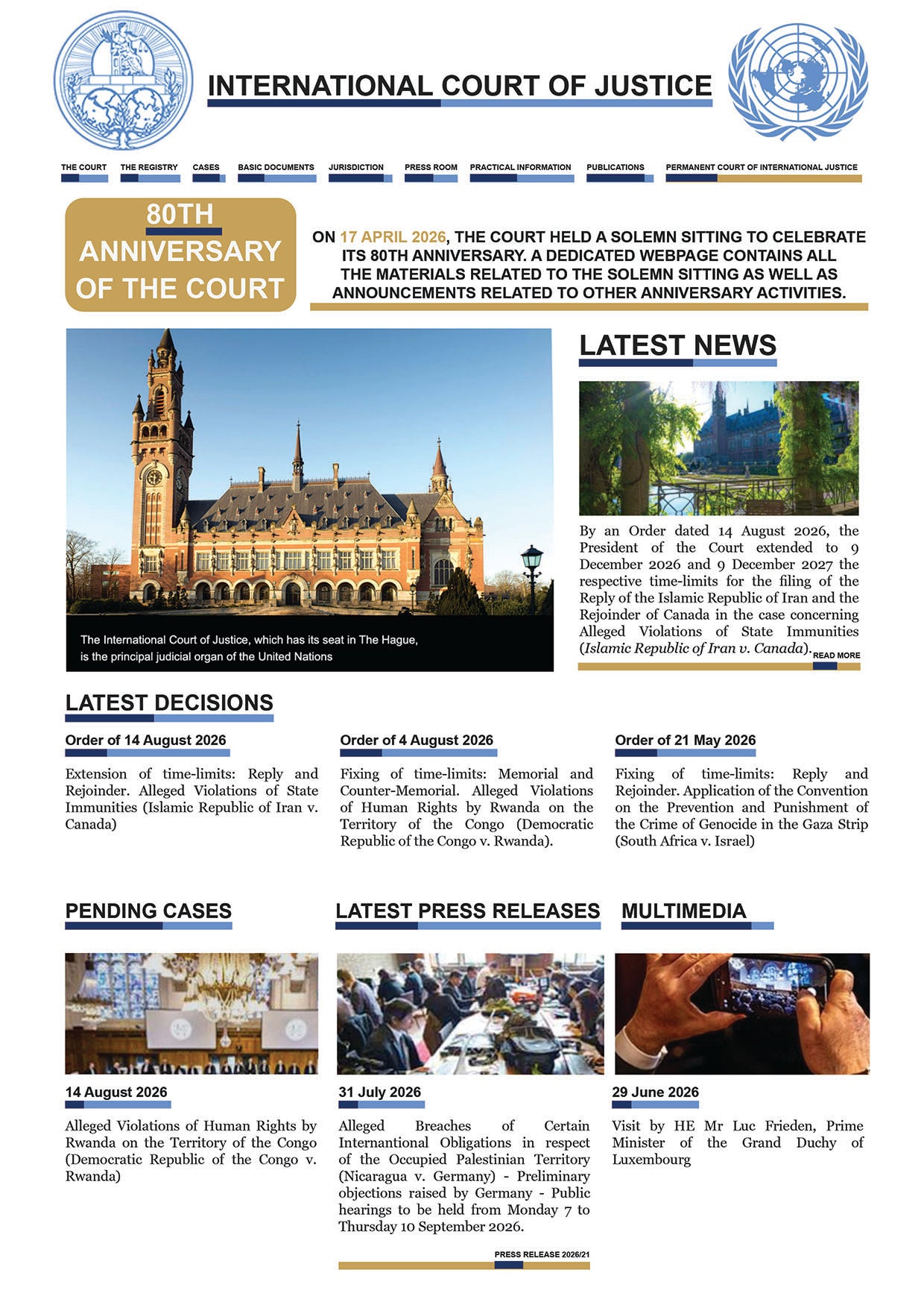
International Court Of Justice — Bleu Truth
Created to honor the 80th anniversary of the United Nations' principal judicial organ in The Hague, Bleu Truth reimagines how global citizens, legal scholars, and journalists access international law. High-level judicial archives often feel distant or overwhelming; the goal here was to build a digital platform that feels authoritative yet open and transparent.
By organizing complex pending cases, court orders, and historical milestones into a calm, structured interface, the design removes visual clutter and honors the weight of public record. Clean typographic hierarchy and a restrained, trustworthy palette guide the visitor effortlessly through the Court's living history.
Primal Geometry & Archival Taxonomy
Designing A Visual Language Of Permanence For The Bank Of Life
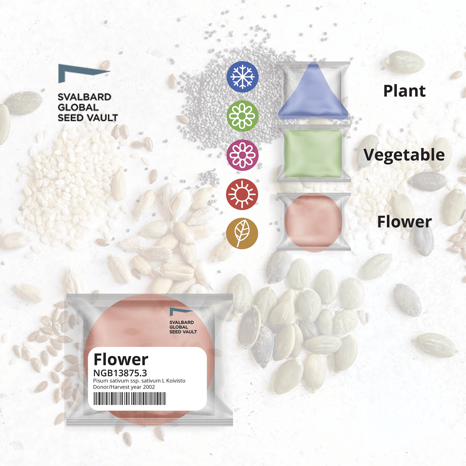
The Global Seed Vault — Civilization Backup
This self-initiated brand identity and visual system reimagines the Svalbard Global Seed Vault not merely as an agricultural facility, but as the "Bank of Life", a sovereign civilization backup engineered to endure across a thousand years.
Stripping away decorative botanical imagery, I built a rigid 1:1 modular grid and a "Pantone Protocol" data structure where primal geometric shapes classify seed varieties. Paired with high-contrast serif typography and technical monospaced indexing, the resulting archival layout (Gabarit) demonstrates how pure information architecture can protect vital knowledge and outlive its creator.